Architect Linux is an installer for the glorious Arch linux. It is distributed as a live-cd ISO, which boots into pseudo-graphical mode and allows installing Arch via comprehensible script which is updated prior to installation from Architect github-repo.
Yes, I know that Arch installation supposed to be made by hands, but using installer is much faster (from my experience) and if it does everything you need it to, why not? What caught my eye was the fact that Architect gets you a vanilla-Arch experience, without any alterations in contrast to Manjaro or Antergos.
Here’s what made me a little bit sad when I visited Architect forums:
![]()
See those jagged letters? This is what got me started. I’m an avid user and advocate of Free Software and a Free culture in general, but when it comes to contributing — there’s hardly anything to mention. So I thought putting a little work into it would be a task adequate to my ambitions.
At first, I was going to just re-render the logo with proper anti-aliasing, or probably make an SVG. However, when I got down to work it became evident to me that some decisions in this logo are at least questionable and there certainly was some room for improvement.
That’s what I ended up with:
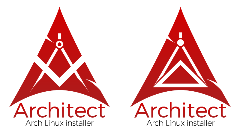
I’m not big on self-compliments, but that objectively looks cleaner and more proper from technical point of view. Yep, there’s some inconsistency with sub-header letters, but this of course should be addressed when preparing actual raster pictures for given sizes and use-cases.
What’s different from the current Architect logo? Well, first of all, my variant is symmetrical. The arc, which is the main element of the logo, is one of the most significant elements of architecture, and its symmetrical appearance should emphasize the structural integrity and reliability of both the system installed and installer script. I tried to use as simple lines as possible, to convey the sense of austerity. I also got rid of the shadows and retained only one vertical gradient which I feel strengthens the visual construction and adds some weight.
Next I thought: How am I going to present this to the Architect community? So I looked up for some info regarding current Arch Linux logo, which is of course the main inspiration and the ground for both old and new Architect logos. I found out that it’s called “the Archer” and was presented by Thayer Williams in 2007 for the Arch logo contest. Here’s his entry: https://dev.archlinux.org/~travis/logo-contest/thayer/1-archer.png. It’s a great logo with a concept behind it and a few possible interpretations. Some discussions on Arch Linux forums showed that different people see different things in it but I haven’t seen anyone who didn’t like it. It’s a great pleasure working with such a great foundation, but on the other hand you know you’re probably only going to make it worse. Hope that’s not evident!
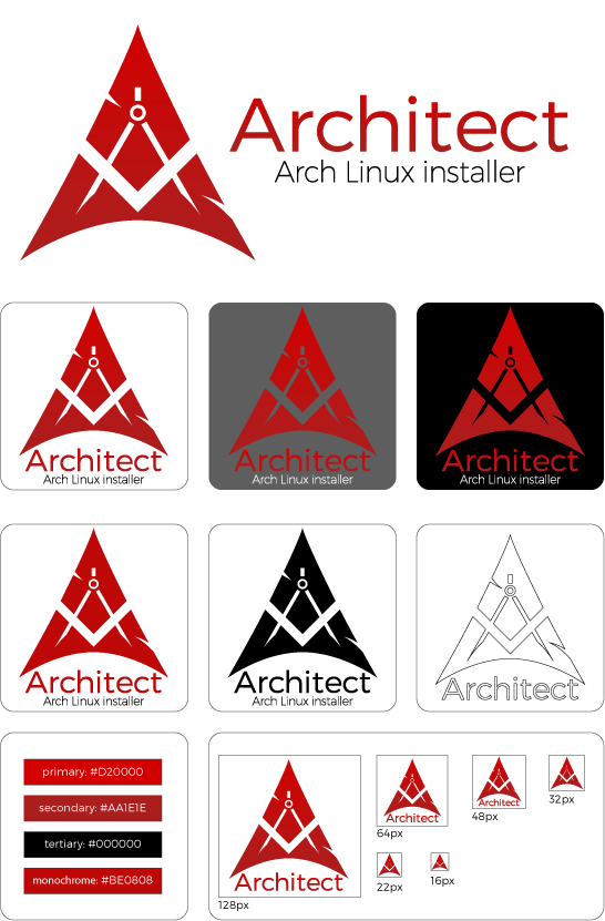
Anyway, I made a similar presentation panel:
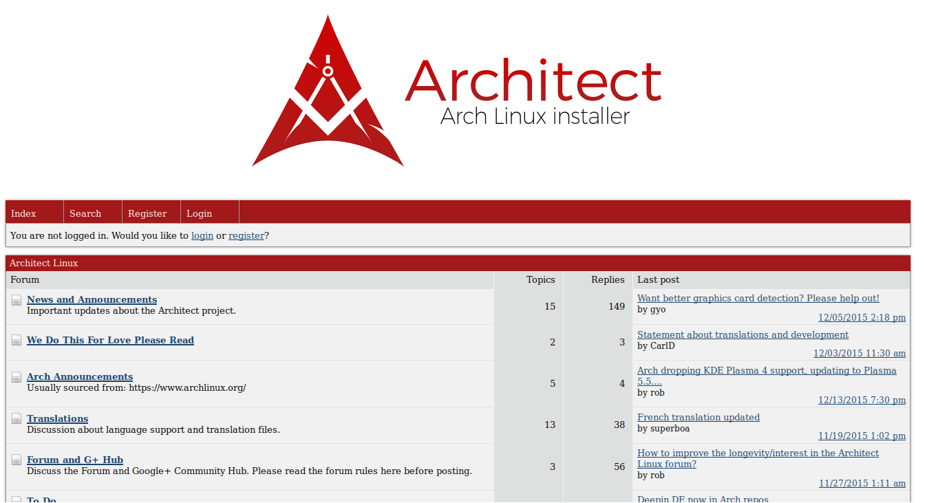
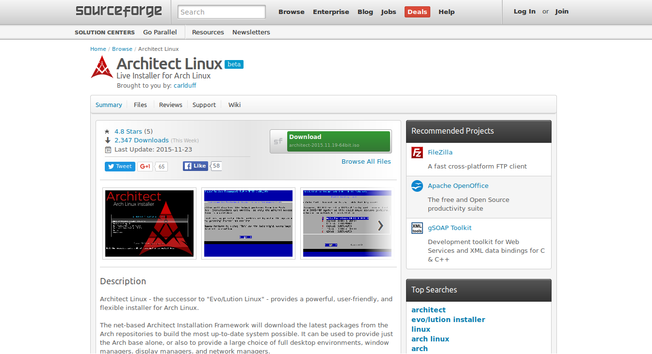
I also made a few screenshots to show the new design in the wild (clickable):
Forums:
Sourceforge page:
Google+ page:

At the moment this redesign is only presented to the community and maintainer of the Architect Linux and for the time being I consider it mine. If it gets past that and becomes accepted I will gladly hand over hi-res vector images as well as the necessary rights to use it to the community.